Colour is more than just a visual element—it’s an emotional connector, a source of inspiration, and a defining feature of a maker’s unique style. For artists, designers, and makers, colour isn’t just a tool; it’s an essential part of the creative process that communicates mood, narrative, and personal expression.
From bold contrasts to subtle, natural tones, each maker finds their own way to play with colour, bringing their creations to life in ways that are deeply personal and unique.
The Playful Palette: Bold & Unexpected Combinations
Some makers are drawn to the joy and surprise of working with unconventional colour combinations.
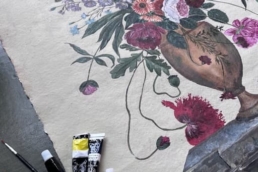
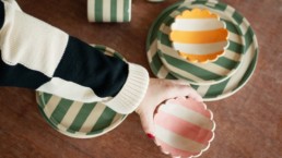
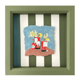
K S Creative Pottery: A Love for the Unexpected
K S Creative Pottery embraces the unexpected, experimenting with colours that others might not typically consider together.
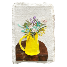
“I am so inspired by colour and very drawn to unusual combinations,” says Kate. “I love a sludgy olive green with a lemon yellow and a soft pink.”
For her, colour adds a playful and joyful dimension to ceramics, often drawing inspiration from holidays and seaside influences. The love for stripes has been a long-standing theme in her work—so much so that she was nicknamed “Stripey Kate” at university. This influence is evident in her Duci stripes, where bright yet soft colours strike the perfect balance between playfulness and sophistication.
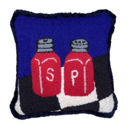
Harriet Says Hi: The Power of Contrast
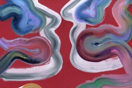
Similarly, Harriet Says Hi thrives on bold, contrasting colour combinations—especially the dynamic pairing of blues and reds.
“I love contrasting colours and predominantly use blues and reds together,” she says.
The high contrast creates an instant visual impact, making her work feel vibrant and energetic. For Harriet, colour choices go beyond aesthetics—they create a sense of tension and balance that draws the viewer in.
Subtle & Natural: A Muted, Calming Approach
While some makers embrace bold contrasts, others prefer a more understated, calming palette.
Meg Fatherly: The Beauty of Muted Tones
For Meg Fatherly, deep blues, soft greys, and warm metallics evoke a sense of calm and simplicity.
“Colour plays a subtle but important role,” Meg shares. “I tend to lean towards deep blues, soft greys, and warm metallics.”
In her collage work, these earthy, timeless shades emerge naturally, evolving throughout her creative process. The result is a palette that feels intuitive and deeply connected to the materials she works with.
Owmi Studio: Finding Harmony in Colour
Similarly, William James Bryan from Owmi Studio enjoys balancing neutral and vibrant hues.
“Once I am happy with a form, I often consider multiple colourways—some more neutral and others more poppy and vibrant,” says the maker.
Owmi takes inspiration from historical Art & Design books, where unexpected yet harmonious colour combinations come to life. For him, working with colour isn’t about following trends—it’s about creating a dialogue between materials, textures, and hues.
Colour as a Personal Connection: From Sketches to Confidence
For some makers, the colour selection process is about more than just aesthetics—it’s about building confidence in their creative choices.
Grace Percival: Colour as the Starting Point
For Grace Percival, choosing a colour palette is the most exciting part of her creative journey.
“Choosing a colour palette is my favourite part,” she explains. “My phone is filled with screenshots. I always start with a rough sketch on my computer so I can play around with the colours as much as I like. That way, when it comes to painting, I’m already confident in my palette.”
By refining her colour choices early, Grace ensures that her designs feel intentional and cohesive from the very start.
Earthy & Grounded: A Love for Natural Hues
For some makers, colour is deeply rooted in the materials they work with, enhancing the natural beauty of their craft.
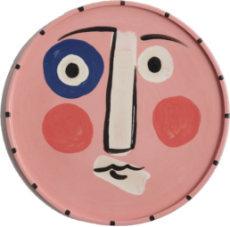
Rosie Gore: Elevating Earthy Textures
Rosie Gore works with speckled stoneware, using colour to highlight the organic textures of the clay.
“Colour is a huge part of my practice, giving a pop to the earthy tones,” says Rosie.
While she gravitates towards greens, browns, and burgundies, she also experiments with seasonal colour trends. Inspired by influential designers like Studio Ashby, Beata Heuman, and Colours of Arley, Rosie’s palette blends the timeless with the contemporary, ensuring her work remains fresh yet grounded.
Colour as a Personal Signature
Whether bold or subtle, earthy or vibrant, a maker’s use of colour reflects their unique style, inspirations, and creative philosophy. Colour is never just a surface-level choice—it’s a language that speaks directly to the heart of their craft.
At its core, colour isn’t just about filling space—it’s about storytelling. It’s a tool that helps makers connect with their audience, express emotions, and leave a lasting impression. Whether through the vibrancy of unexpected combinations or the serene calm of muted tones, colour is a powerful force in the hands of every maker.